Knowing that Macmillan had decided to give new covers to the entire Peter James Roy Grace series in paperback, to coincide with publication of the 10th volume was exciting enough, but when the new designs were revealed, they were stunning! Everyone in the agency loved them when we saw them on screen, and when the finished books arrived we admired them even more.
We were keen to hear from the designer, how he went about creating the new look. In advance of the publication this week of the 11th Roy Grace novel YOU ARE DEAD, Neil Lang, Digital Design Manager of Macmillan, has kindly written about how be designed the new covers.
The redesign of the DCI Grace Peter James covers evolved from what is already a successful brand. I wanted them to have more impact in bookshops but especially with a view to online sales.
When starting to redesign the Peter James covers I initially started with a blank canvas. I tried a more iconic look, with some designs using figures as a main feature, or even a simple typographic approach, but ultimately the setting is possibly the biggest character of all and the best starting point.
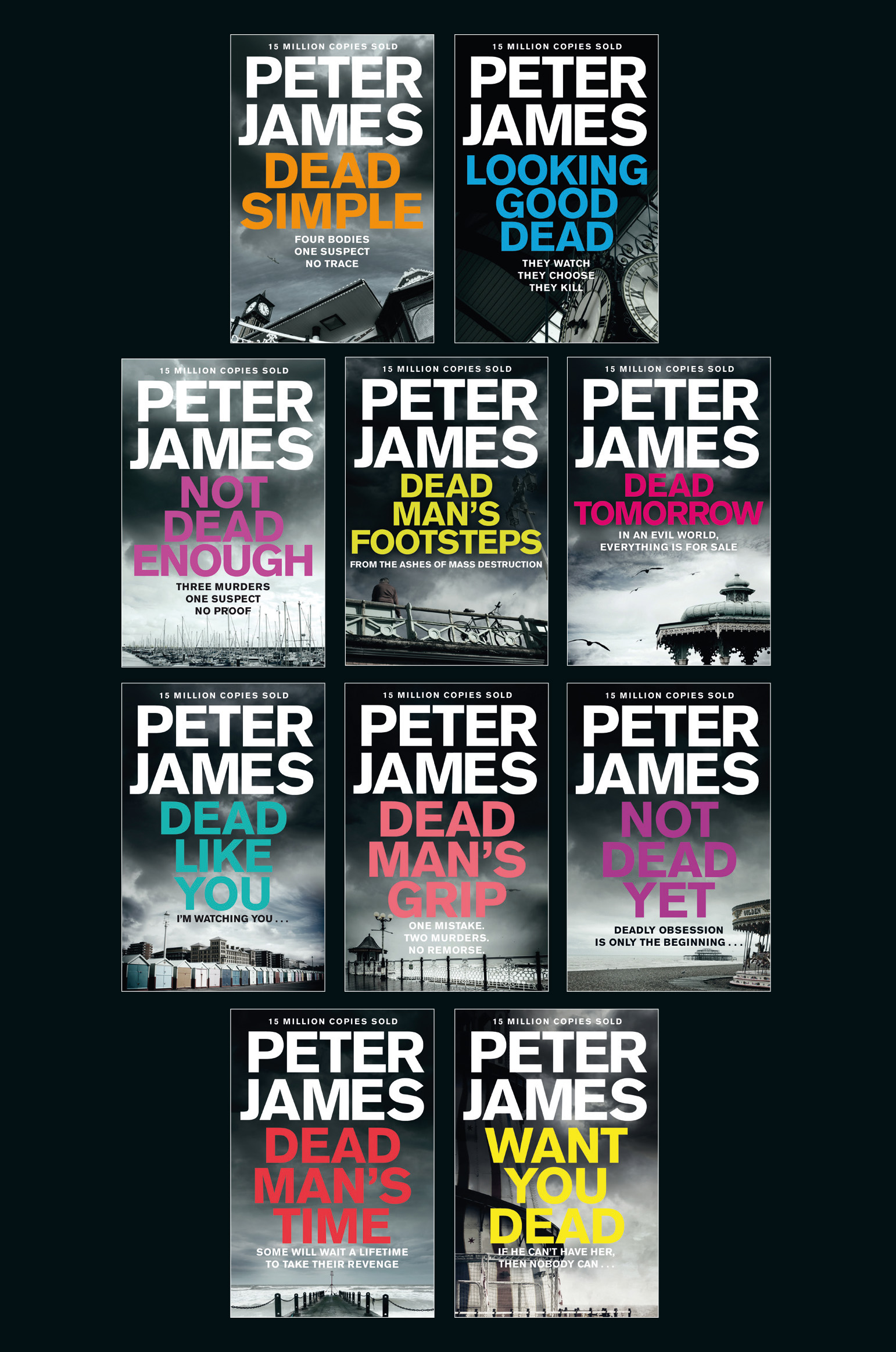
I tried to use images that weren’t quite so obviously Brighton but which would be recognizable to anyone living there, or familiar with Brighton: landmarks such as the Helter Skelter on WANT YOU DEAD, which is to be found on the pier, or the clock from Brighton train station on LOOKING GOOD DEAD. Sometimes we took an image at a slightly different angle, like that on DEAD SIMPLE where I took the photograph looking up from the beach at the exit to the pier.
Several different typefaces were used on the author branding but whenever they were shown everyone still seemed to prefer the original. Again, this is something that has changed slightly from earlier editions with the author name now taking up more of the cover, closing up the spacing between the letters, and aligning the P and J.
One of the key things in the redesign was to make more of the titles, making them much bigger so they can be read easily even as thumbnails online. By desaturating the image it becomes more of a background on which the titles in a bright pantones and fluros have much more impact. Used in combination with a matt finish and spot varnish over the embossed lettering it makes the physical books stand out more.
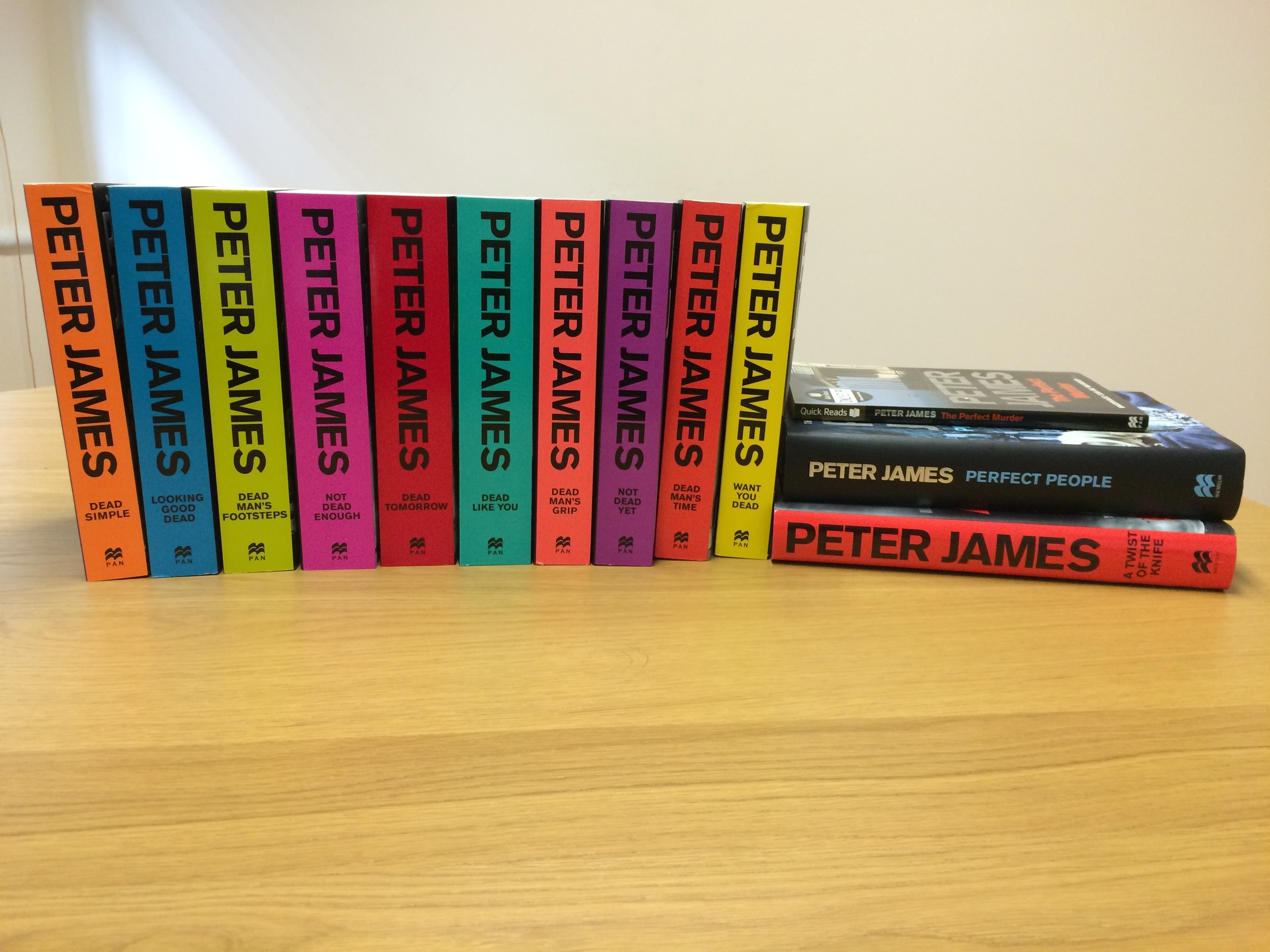
The bright colours also act as a series identifier, which I’ve carried over onto the spines, using Peter James author branding much larger so there can be no doubt when seen on a bookshelf who the author is.
Peter James' new book, YOU ARE DEAD, is published in the UK this Thursday by Macmillan.


